Omega Strikers
Redesign
Jun. 2023 – Aug. 2023
UI Designer

Design Team
Keywords
Layout, Iconography, UI
Tools
Figma, FigJam, Illustrator, Photoshop


In this project, I collaborated with UX designer Ava Liao and technical artist Steve Glatfelter to redesign Omega Strikers in about 2 months.
Omega Strikers is a recently-released 3v3 action sport video game. Its gameplay is fast-paced with flashy and vibrant visuals (and an energetic soundtrack!).
We started off our project by identifying competitors. Then, we spitballed keywords, using them to help us research visual references and create a moodboard. Some games and shows we were inspired by included Persona 5, Cyberpunk: Edgerunners, Mirror’s Edge and more.
Style Guide
We explored multiple color palettes, referencing both the original game palette and those from other games and media in our moodboard. We also considered a variety of typefaces and pairings, experimenting with both bold, condensed, and serifs to find the most suitable characters.
The final color palette was inspired by arcade rhythm games, which matched the lively spirit of the game. The bold and blocky lines of the primary typeface reflected the sports aspect of the game, while still having diagonals that echoed the speedy movements of the Core in game. Our secondary typeface was more neutral for easy readability, while its sharp and boxed angles complimented the primary typeface well.


Home screen
To ensure we were creating optimal designs for the player base, we conducted user interviews. We made sure to survey both those that were new to the game and established, regular players. After this, we learned a lot about what was working in-game and what was not. For instance, some players were surprisingly unaware of what the player icon was, even mistaking it as an indicator for whether party players were ready or not to queue a match.
With these in mind, we started to tackle the homescreen, starting with explorations on layouts, shape language, button styles and icons.


Game Mode Art
Once we established the visuals of our buttons and home screen, we started developing the modals in the home screen, such as player profile or game mode. In Omega Strikers, a game mode was depicted with character art. However, having one striker be the face of a game mode felt confusing especially since those same character artworks were used in the Strikers feature. I was determined to lessen this one to one association. Because the project was on a timeline, I did not have the time to illustrate my own character arts so I looked into existing trailers and graphics. In this way, although we still used character splash arts, the game mode was represented as a scene rather than one character.
Logo
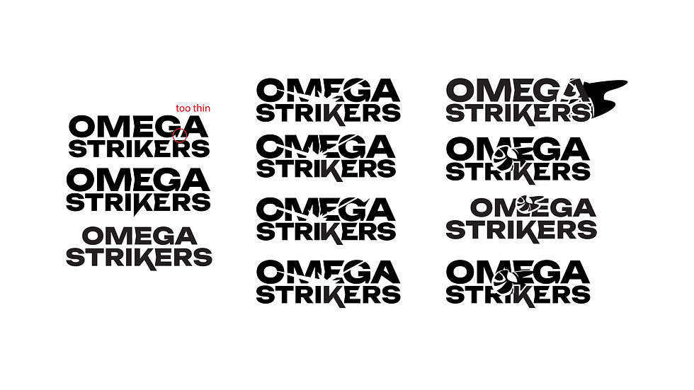
I explored ways which I can highlight the diagonals of the typeface and create more motion with just letters.
After establishing my letterforms, I wanted to bring the Core into my logo. I experimented with depicting the Core differently from the original Omega Strikers logo. I wanted to express more motion, while still keeping a similar silhouette. However, in the end, the team and I decided the simplified logo that focused on the movement or trail of the Core was more effective.


We created various cases to test out our designs. For example, what would the busiest, most chaotic screen look like with a full party and chat box open? At the same time, I started to package the designs to implement into Unreal Engine.
There are a few minor adjustments and tweaks in the designs to accommodate easier implementation. However, we were able to get the unique button shapes and hovers into the engine, thanks to our technical artist, Steve. Check out how he built this in Unreal Engine 5 here.


